Monday, 2 May 2016

Evaluation Question 5

5.How did you attract/address your audience?

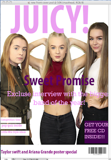
How i attracted my audience on my front cover:


The colours used will generally attract my target audience. The bring colours will catch a lot of peoples attention.

Sweet promise is the main writing because it is the main story, this will get my audiences attention, also the buzz word "exclusive" draws attention because now, when a person read it, they know that the information inside can not be found anywhere else.

Using bigger writing to advertise free give aways inside the magazine, or giving people a chance to win free stuff will make my audience want to buy the magazine, even a lot of people who are fans of the big superstars, will purchase the magazine just for the free posters of there idols.

Another way i attracted my audience was using all three females for the pictures, even though it could still attract males there is more of a chance females will be interested in buying it.


My contents page colours have been kept the same, this is so there is a theme through out. I made the layout clear to read even though it contains a lot of information.

I used justin bieber in this because i know it will get a lot of attention, also a different genre will be drawn in because there is a new CD advertised which isn't just pop music.

Facebook and twitter have been introduced to the audience through my contents page because i think social media plays a big part in getting word out. I made this stand out by making it a large box with a black background, so that it is one of the main parts a person would look at first.

Also by showing i have featured 10 different pages, it will cover a lot of peoples interests, it is more likely they will want to read and buy the magazine if they see something they are intrigued by.


The quote i used,'we made our dream a reality', makes others want to read this to see if the 'band' has any advice for the aspiring teenagers, the writing i included is kept simple to read and the questions will interest the teenage audience i am aiming my magazine too.

The 6 images i included of the girls show different sides to them, that 'fans' want to get to know, it shows they can be serious or can have fun.


Evaluation Question 4

4.Who would be the audience for your media product?


When i was thinking about the audience for my magazine, i done some research on some similar magazines, which helped my understand what my final aim would be. 


i found that doing this gave me an idea on my audience for my magazine, these two magazines are aimed at people the same ages as mine, it also gave me ideas on the layout and colours i needed to attract the people i wanted too. Most of the people who purchase these two pop magazines are female, just like what i was aiming for.


My target audience would be teenage girls, who have an interest in pop music. This is one of the reasons i chose girly colours through out my magazine, another thing is that teenage girls are pictured on every page i have done which will help to draw in the teenage audience i am trying too. On my front cover, world famous stars are advertised, they are again both female, making it seem appealing to girls who listen to their music, also a way of attracting the attention of the people who are fans because i am advertising free things inside.


The colours play a massive part in identifying the audience, the colours pink and purple are bright and stand for, happiness, fun and joy. Even though they are mainly colours that would stand out to girls, boys could also be attracted to this type of pop magazine.

Sunday, 1 May 2016

Evaluation Question 3

3.What kind of media institution might distribute your media product and why?


Immediate Music distributes top of the pops, this magazine includes fashion, pop music and posters. I chose this company because it already advertises a magazine that is very similar to mine, but it may not be the best for this company because having two magazines similar to each other could start to effect sales of 'top of the pops'. Even though Immediate music would be a good to distribute my media product, it may not be a good idea for them to do so.


The genre of my magazine is pop, i chose this because bright eye catching girly colours will be used, my target audience is 13 to 18 year olds. Another reason i decided to make my magazine pop is because a lot of artists are pop artists, these will make my magazine popular because a lot of people are fans of the stars shown inside or on the cover of my magazine, JUICY!

When researching, i found that many other similar magazines have the same price range, or the same conventions.

Thursday, 28 April 2016

Evaluation Question 2

2.How does your media product represent particular social groups?

My media product is aimed more at women than it is at men, this is because all three of the actors used throughout my magazine are female, even though males are wanted to buy this magazine.
My magazine will be aimed at people the ages of 13-18, the actors i used are all between these ages and will draw in my target audience, also the 'Band' and questions they answered, are suitable for this age range.
I also think the pictures used in my media product show females to be strong, fun people, like shown in the following pictures:


Also, because of the target audience i am trying to appeal too, my price £2.50 is suitable because it is affordable for people at school or college.


Friday, 22 April 2016

research for Evaluation Question 1

  1. In what ways does your media product use, develop or challenge forms and conventions of real media products? 

 Mast Head

This is my Mast Head, it is the name of my magazine. It covers the top of my front cover, like most mast heads, i used the colour pink because it is one of my main colour schemes, also the colour is not dull and will be eye-catching. I choose this name for my magazine because it tells the audience that inside the magazine is gossip, it intrigues people in.

Barcode
Using a barcode on the front cover is a convention of real media.

Sub headline
A sub headline is another convention of a real media product, here i made sure the audience would know what it inside the magazine as the main article, still sticking to my colour scheme.

Buzz word
The word exclusive tells the audience that this will be the only magazine featuring what is advertised.

Fonts
On my front cover, contents page and also double page spread, i have kept my fonts either the same or similar all the way through, i decided to do this because it is easy to read for the ages i am aiming for, even the little details like the date and issue number is kept simple. Even though my mast head and main headline is larger than the rest of the writing, the font it still kept simple and bold.

Contents page
For my contents page, real media conventions was important, i had to balance the information about whats in the magazine to advertising what else the audience could win or free gifts inside i got this idea from another popular pop magazine, i then compared it again to what i wanted, this is what i found;

Double page spread
When i was making my double page spread, i looked at the conventions of other pop magazines, this gave me an idea on the layout i was going to aim for, this is the example i looked at compared to my own double page spread;

I tried to keep some conventions the same, using the space provided in the right way and getting in the information i needed, also the pictures i have decided to use portray happiness and fun.


Sunday, 3 April 2016

levels


This is a level 2 piece of work, i have chosen this because it has a similar layout to my front cover.
To improve this i could make my writing smaller and add more detail, this could get me to a level 3.


contents page:
This is the style model that i have chosen to compare to my contents page, it has a similar layout to my contents page.

Double page spread:
This double page spread is similar to mine because there is more than one image and a large piece of writing.