Friday 23 October 2015

contents page title


here is a drop shadow added, onto my contents page

drop shadow

Here i added a drop shadow to my subtitle on my contents page.

inner shadow


Here i added an inner shadow to my front cover.

layers on front cover

These are each of my layers on my front cover


  • First there is a picture and the background colour,
  • then the masthead is added,
  • then the issue number,
  • and lastly the subtitle.


subtitle on front cover

This is the only text i have changed the colour of on my front cover, i done this so it stands out and also so it matches my school colours.


photoshop

this is where it is visible i done both my contents page and front cover on the same photoshop, i arranged it, then clicked 'float all in windows'.

text

here for my sub title, i have used the centre writing instead of putting it in ether side.

contents page font

although i have kept the same font all the way through, i have chosen to make my text bold.

subtitle

 
This is the sub title i chosen, this matches my picture that is on my contents page.
i have carried on the same font.

moving over my masthead

this is my mast head i moved over to my contents page, this was easier for me as it was already the same style.

Final magazine.

Final front cover and contents page.

These are my final pieces, using the school colours, blue and white. 

layers on my contents page


These are all my layers on my finishes contents page.

contents page information


Here is a new layer, with the numbered pages for my contents page.


i have once again used the text tool and decided to make my writing bold.

Thursday 22 October 2015

contents page picture

Here i have picked a picture to be put onto my contents page, i cropped the picture using the cropping tool.
i chose to do a picture in science to show what the school offers.

Tuesday 20 October 2015

Adding in text

Adding detail.


Here i have added the date and issue number to my magazine, i done this because i think it looks more professional. This is a new layer.


Now i am adding in details to my front cover, this makes it more interesting. This is a new layer.


This is the text tool i have used to add on the text above.

Sunday 18 October 2015

Assessment

Trainspotting 

At the opening of this scene, we see they are in a crack den, now they add comedy into it when talking about drugs and referring to 'sean connary'. In the first scene there is diegetic sound, such as the baby crying, which we hear in the background.Just as this scene is finishing there is a sound bridge (the sound of the train) this joined both scenes together naturally by running a soundtrack to link them, this sound of the train is non diegetic.

Just as he had got home, to try and get himself of drugs, we now hear non-parallel music when there is posh music being played while the setting he is in, is completely different. Also in this same scene there is a voice over, while the music is playing, this shows what the character is thinking, in this case it was like a list of instructions, this is used to bring humour to the scene. The scene ends with diegetic sound when this character meets the dealer, this is when humour is last used.

Thursday 15 October 2015

Layers


layers


Here you can see i have used layers in my work. i done this so it is easy to change things and also easier to view things.


Wednesday 14 October 2015

Front cover

My front cover and removing background.
 When putting my front cover together, i decided to choose to follow the rule of thirds.
Here is where i took the original background of the picture out using the eraser tool and the magic wand, i then added in a blue colour with the paint bucket tool.

Masthead


Editing my masthead
I decided to call my magazine 'Bridge High', i chose plain black for my colour and also changed the font of my text, i done this in order to make my text stand out more.

here i am adding in the text with the text tool/

Tuesday 13 October 2015

media quiz

media, cinematography.
 
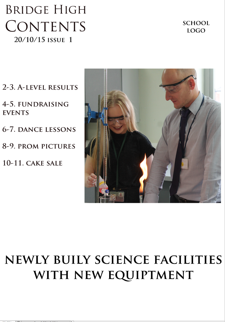
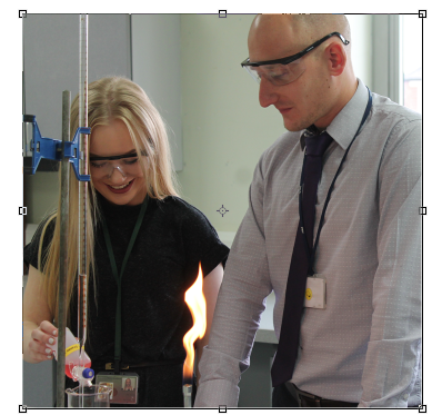
1-  This is a two shot, the camera position is eye level. High key natural lighting is used.
 
2-  This is a medium close us, eye level shot, with side lighing being used.
 
3- Here a low angle shot is being used, with a low angle camera position, once again this is natural lighting.
 
4- A low angle shot is being used here, with side lighting.
 
5- Here a long shot is being used with low key lighting, this makes the figure look more myterious and threating as it is not clear who it is.
 
6- Now a medium long shot is used, with two people with there backs to the camers, along with the back lighting coming from the door, this creates a tense mood for the audiance as it is unknown who the two figures are, or what is through the door.
 
7- This is a looking into space shot and medium close up, it is also eye level. Side lighting has been used to create a dramatic look.
 
8- A long shot is used here, side lighting and under lighting is used with a focus on the two people, this creats a thretaning and mysterious mood.
 
9- Over the shouler shot is being used here, with us being able too see the people in the miror, infront of them. Harsh side lighting is used, witch creates a dark image.